One health app for doctors, medicines, tests and insurance
Overview
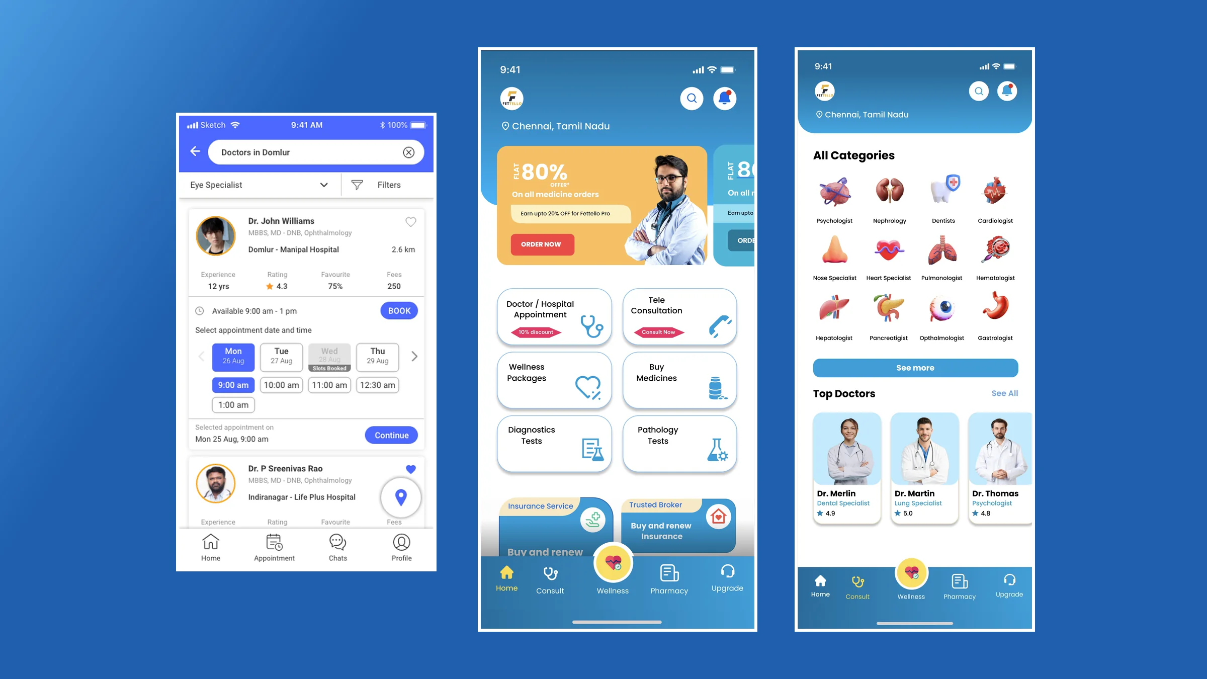
Fettello is a health app for people in Chennai. Doctor and hospital appointments, tele consultation, medicines, lab tests, wellness packages and insurance all live in one place. I designed the home, the specialist directory and the doctor booking flow.
My role
Product design, UX and UI
Platform
Mobile app
Market
Chennai, India
Impact overview
Services
6 health services one tap from the home screen
Discovery
12 specialities shown as the organ they treat, no jargon needed
Booking
3 taps from a doctor’s card to a chosen slot: day, time, continue
The 30 second version.
Summary
How I put everyday healthcare into one app without making it feel crowded.
Booking a doctor, ordering medicines, getting a blood test and renewing insurance usually means four different apps or phone calls. Fettello brings them together.
I designed the structure, the home screen, the specialist directory and the appointment flow, plus the visual language: soft blue, rounded cards and friendly 3D icons.
The challenge: fit six services on one screen and still make the next step obvious.
The challenge
Health apps often try to do everything, and the home screen turns into a wall of banners. But people open a health app in a hurry or when they’re worried: they want a doctor today, or a refill now.
Many people also don’t know which specialist they need. “Nephrology” or “hepatology” means little when the problem is your kidney or your liver.
The goal: one calm home for six services, and a way to find and book the right doctor without medical vocabulary.
Structure
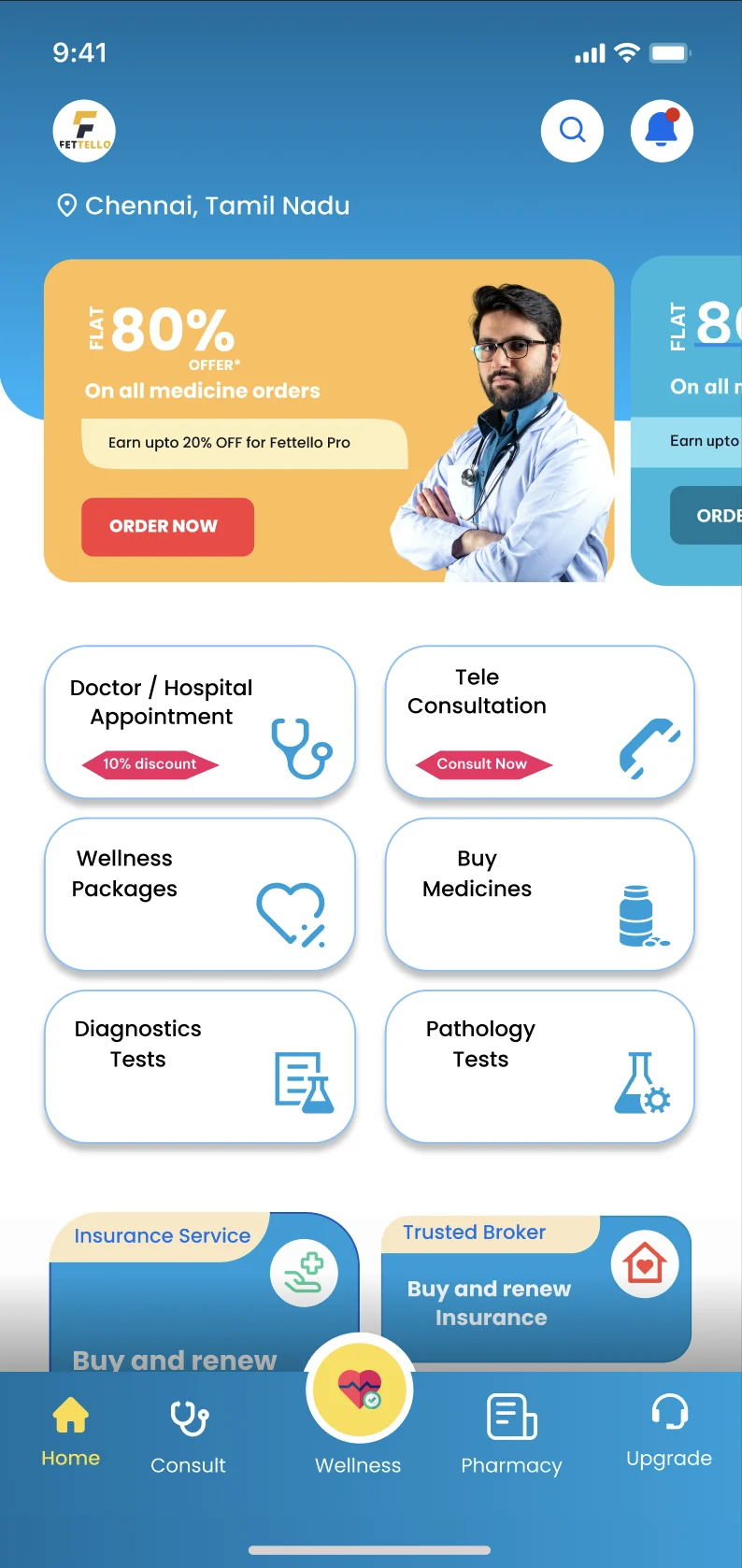
I organised the app into five tabs: Home, Consult, Wellness, Pharmacy and Upgrade. Wellness sits in the raised centre button, so the everyday habit is always one tap away, not only the one-off visit.
On Home, the six core services sit in a two-column grid of equal cards: doctor or hospital appointment, tele consultation, wellness packages, medicines, diagnostics and pathology tests. Each card has one icon and at most one tag, like “10% discount” or “Consult now”. Offers live in a single swipeable banner at the top, and insurance gets its own row at the bottom.
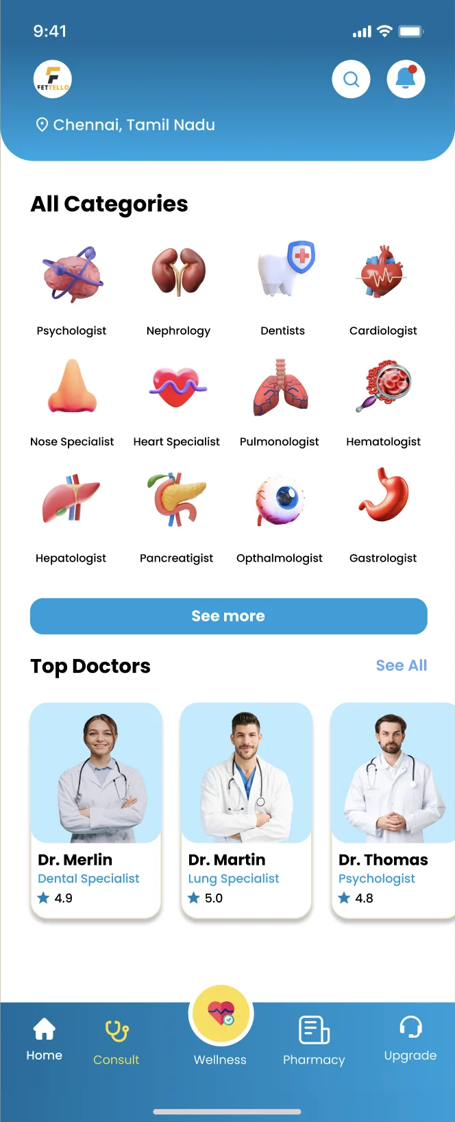
Home: six services in one calm gridConsult: specialities drawn as the organ they treat
Finding the right doctor
Let the picture do the explaining.
Organs, not jargon. Twelve specialities, each shown as a 3D icon of the organ it treats. Tap the kidney, not the word.
Plain labels. “Nose specialist” and “Heart specialist” sit next to the medical names.
Familiar faces. Top doctors show a photo, speciality and rating, so people can pick someone they recognise.
Booking a doctor
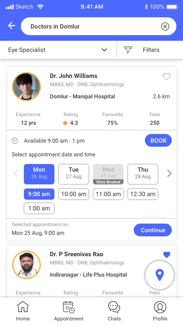
Each doctor card answers the questions people ask before they book: qualifications, hospital and distance, years of experience, rating, how often patients favourite them, and the fee. Dates and time slots open inline on the card. Fully booked days are greyed out, and the chosen slot is repeated above Continue, so there are no surprises. A floating map button shows the clinics nearby.
Booking right on the doctor’s card: pick a day, pick a time, continue
Visual language
A soft blue base, white rounded cards and one warm accent reserved for offers. 3D icons make medical topics feel less clinical. A location chip at the top, Chennai, Tamil Nadu, tells people up front which doctors, pharmacies and labs they’ll see.
What I learned
Plain words beat medical terms. Let icons and everyday labels do the explaining.
Put the answers on the card. Fee, distance and free slots up front remove the back and forth before booking.
One raised action in the navigation is enough. Two would compete.
Further reading
More projects, from enterprise tools to retail apps, are on the Work page.